


A window on the art
The whole design concept, by young visual designer Mirit Wissotzky from Israel, was created around the world of art and especially Manaresi’s art of engraving.
 For example, in the engraving technique the artist creates a frame, each time differently, by pressing the piece of copper on a bigger piece of paper: this frame became the leading component of the brand, each time it changes format and the art that is contained inside.
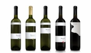
Now, take the label: the label is a frame of an art work, and wraps around the bottle at 360°. The piece of art is the wine, where you usually find a label, here on Manaresi bottles you just see the wine for what it is. The winery brand is the signature of Paolo Manaresi revisited by graphic work. Other important components are the four decided colors (red, gold, silver and green), one for each kind of wine. These sometimes appear as the dot (inspired by the ‘sold’ or ‘booked’ red dot you see on paintings at an exhibition), other times they come in different rectangle formats or even in photos (as in the web site backgrounds).
The 6 bottle box represents Paolo Manaresi’s engraving masterpiece that in 1954 was awarded first prize at Venice “Biennale d’Arte”. The box itself is a piece of art, almost worth becoming a part of your Manaresi collection…